Eden Condominiums is a multi-residential project in the Mont-Royal borough, an iconic and sought-after neighbourhood on the island of Montreal. In order to launch before the summer season, the identity, brand aesthetic, sales office, advertising campaigns and all other marketing collateral were designed and delivered in a condensed timeline just shy of six months.
The project was an astounding success: having launched in late spring, 80% of the units were sold by the end of the summer. (2015)
Creative Direction
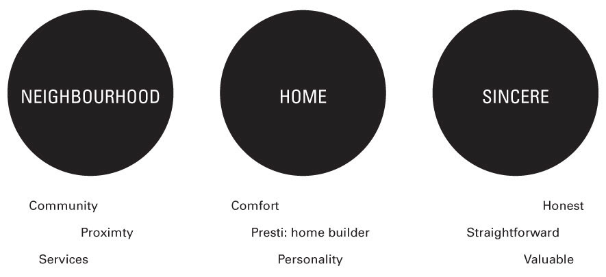
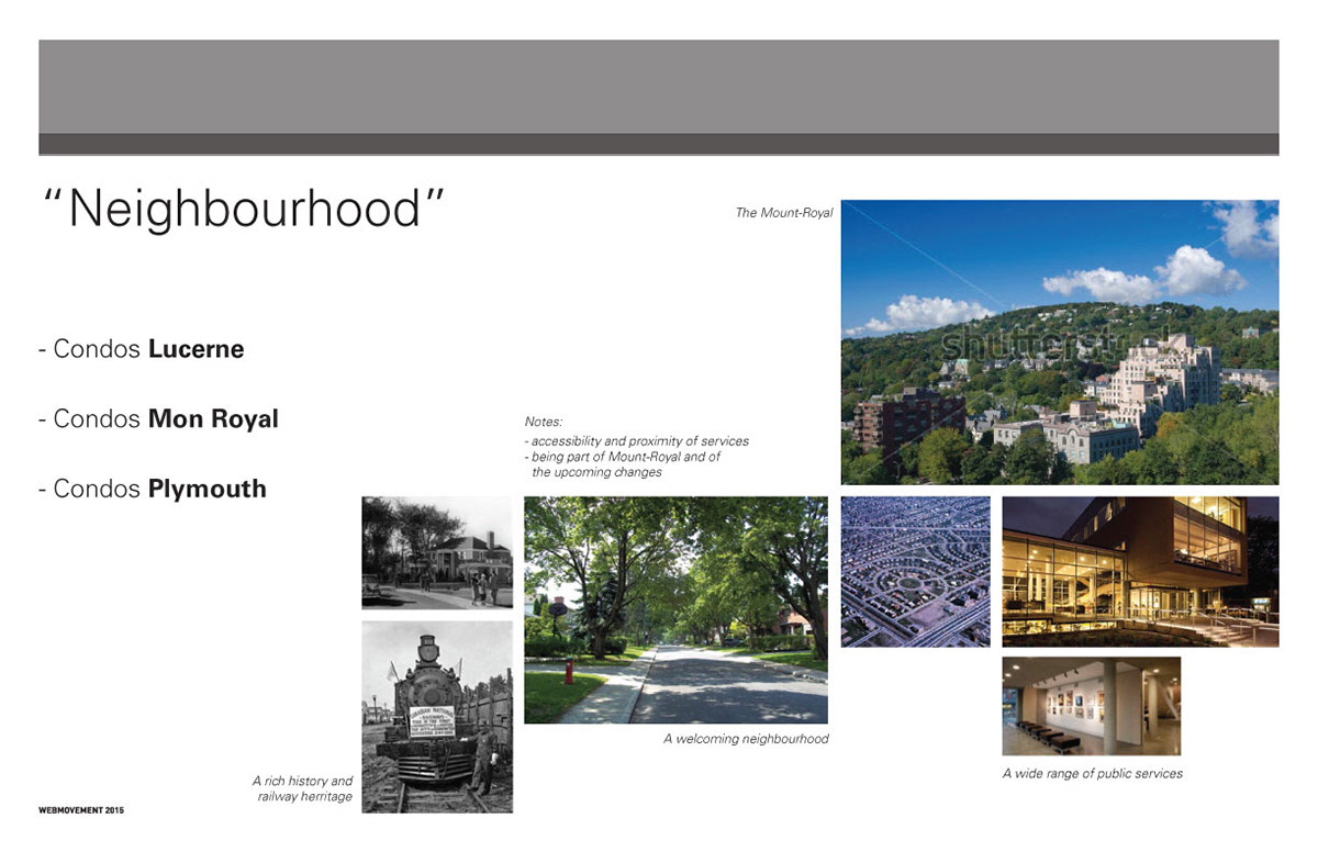
The three main directions presented to the client:• the Mont-Royal neighbourhood
• the client's expertise in luxury custom homes
• the street name "Eden" and the Gardens of Eden
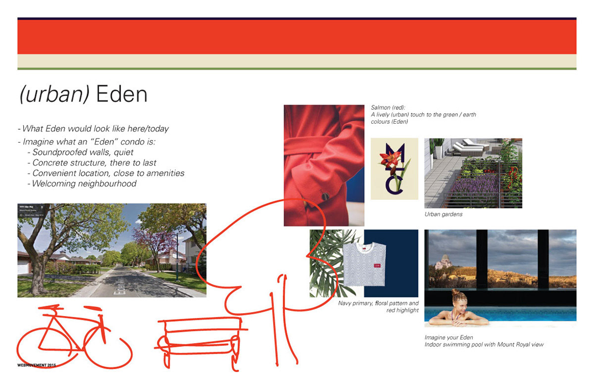
The Eden concept seemed like the obvious choice, but an alternative twist was suggested: "what would living in Eden look like right here, today?" The concept of the "urban Eden" offered great storytelling opportunities while remaining relatable, which was a refreshingly different from other high-end condominium projects.


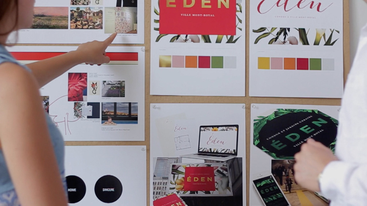
Brand Aesthetic
Creative direction: We Are Booth + Alex Brovkin
Graphic design: We Are Booth
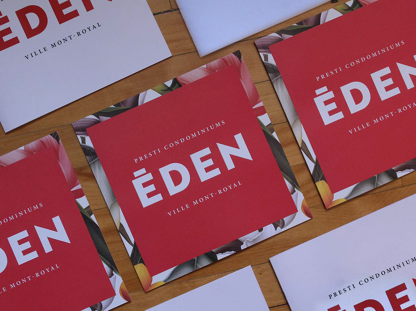
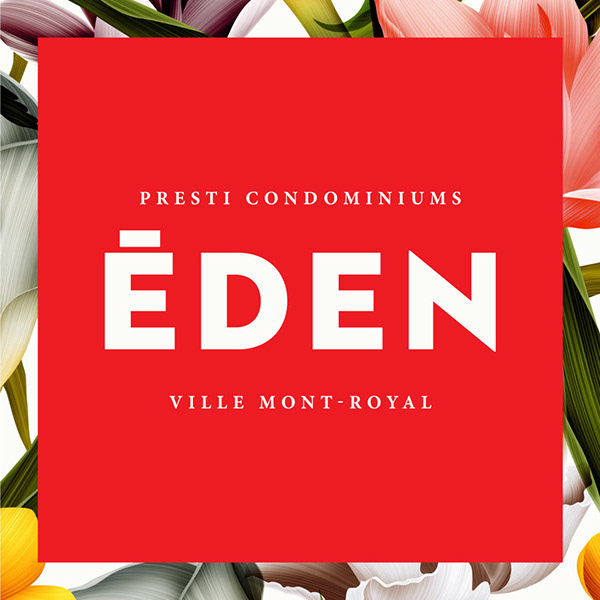
The floral pattern was well-suited for the garden theme, as well as timely for a spring time launch. The hue of the red colour, as well as the floral pattern, were largely inspired by the season's fashion trends. Gold foil was originally considered for the lettering, but was taken out of the colour palette. The bold logotype is legible at all sizes and adds a masculine touch to an otherwise feminine aesthetic.
Brochure
Creative direction: Alex Brovkin + We Are Booth + Nik Brovkin
Graphic design: Nik Brovkin
Photography: Alex Brovkin
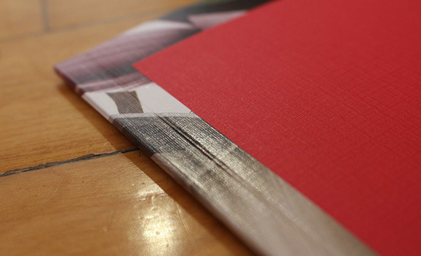
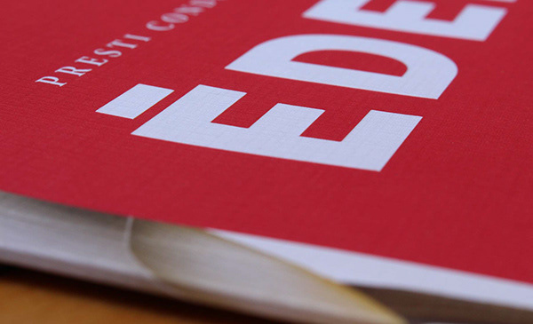
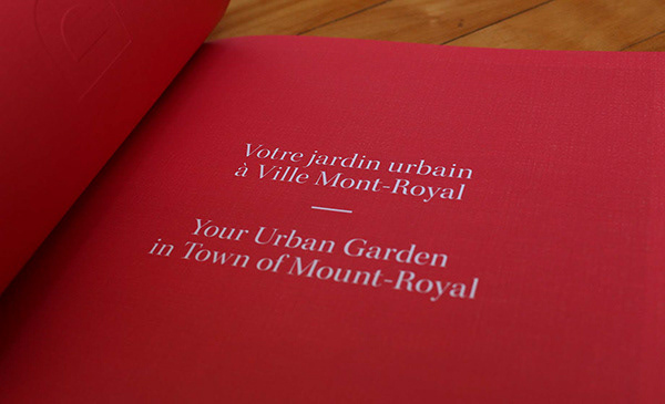
Cover: linen cardstock, embossed logo, UV spotlight finish on floral pattern, perfect bind. The UV spotlight follows the outline of the flowers, which makes for a very rich contrast between the linen and the glossy finish on the borders and spine of the brochure. Fun fact: As these print finishings require long lead times and high quantities, the cover was designed and sent to production months before the copy and creative for the brochure were finalized. This made for an interesting design challenge, but allowed for the brochures to be ready for the opening event.


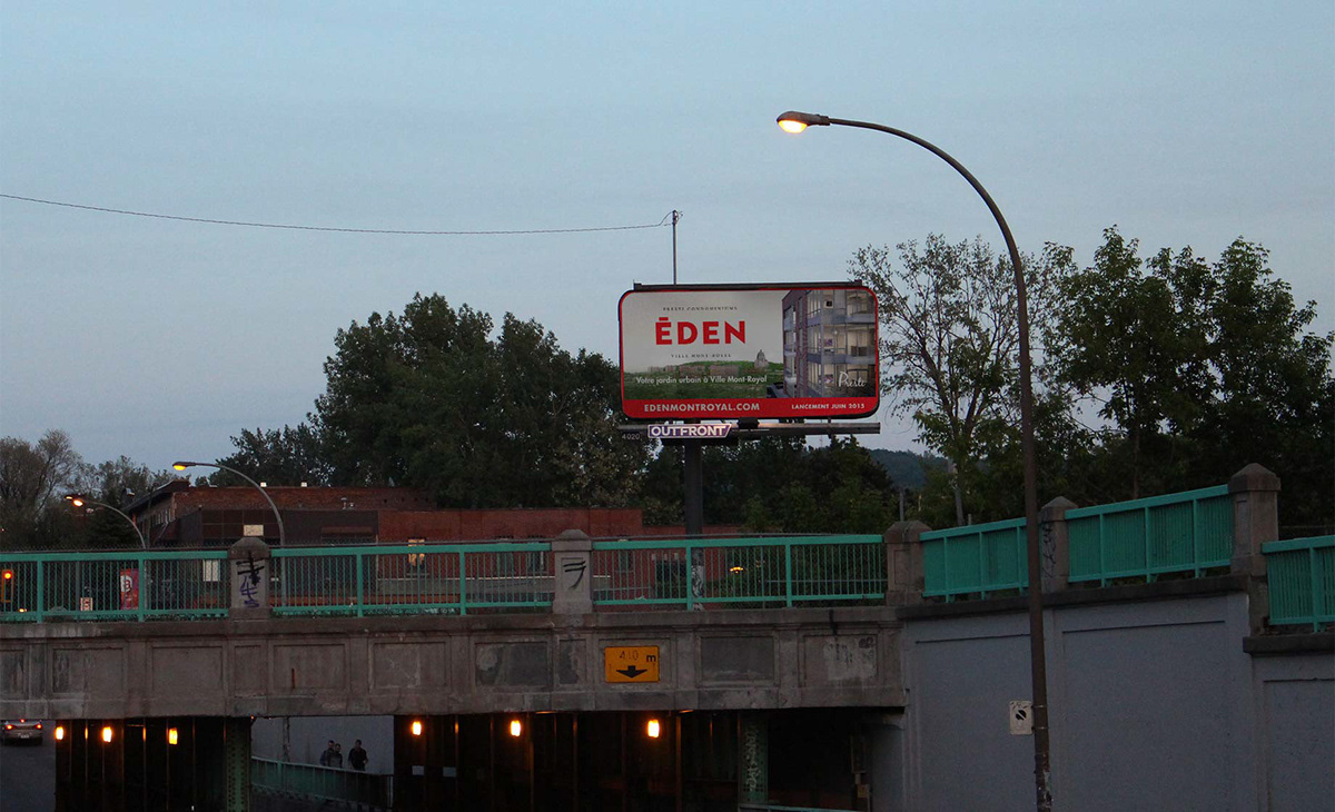
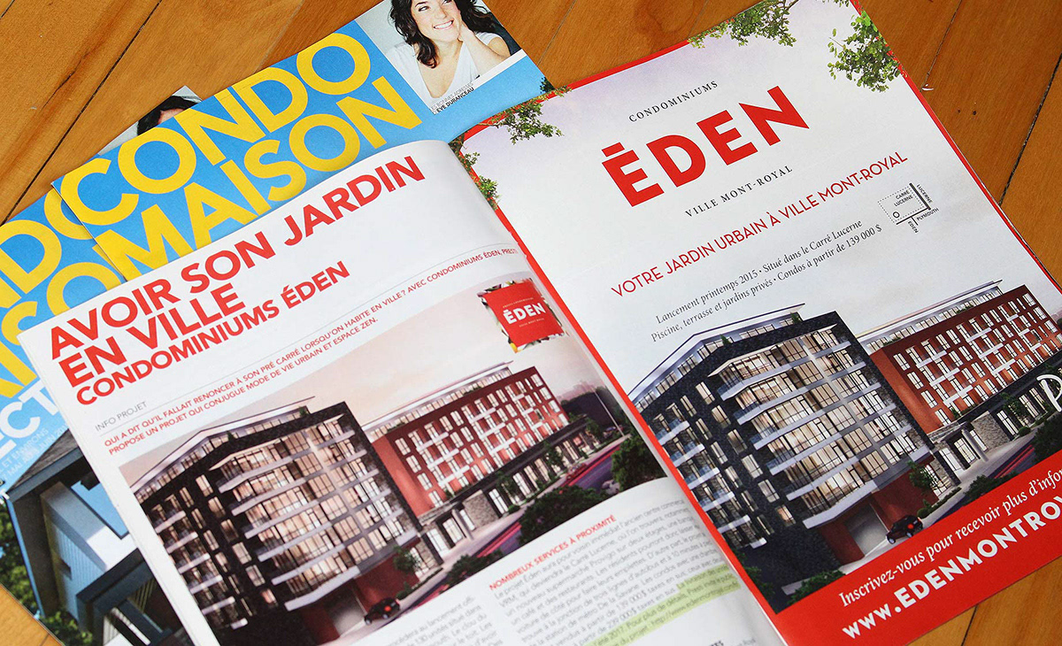
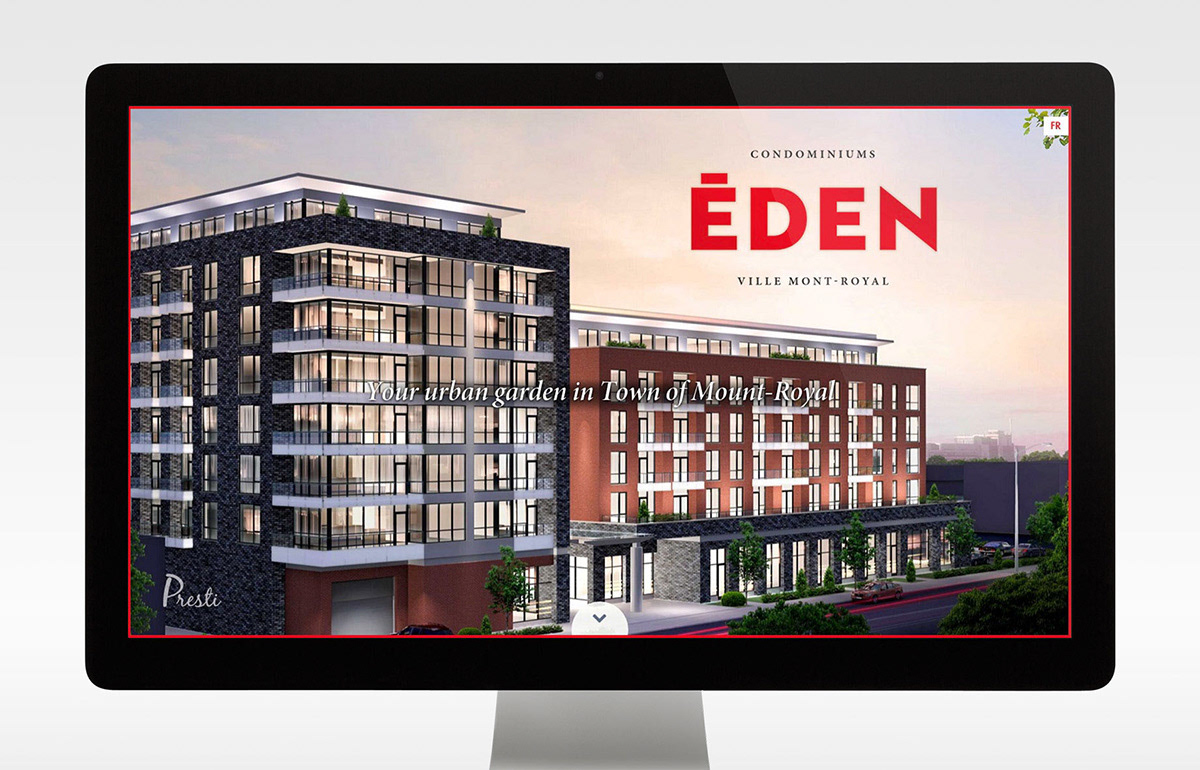
Ads and website


Related: Sales office design
